Friday 15 February 2019

Evaluation


Initial ideas & theme


Aiming to do something challenging and different from previously, I decided to have a contrary element then my individual interest i.e. traditional patterns.
I intended to produce my samples inspired by Futurism for interior i.e. a car, public space like hospitals. Something futuristic and modern for a public space; unusual and ‘future forward’ for a car, as the theme of the brief suggests.
Futurism is a common theme throughout this entire unit. To have one element in common throughout a project helps me come up with one directional body of work.
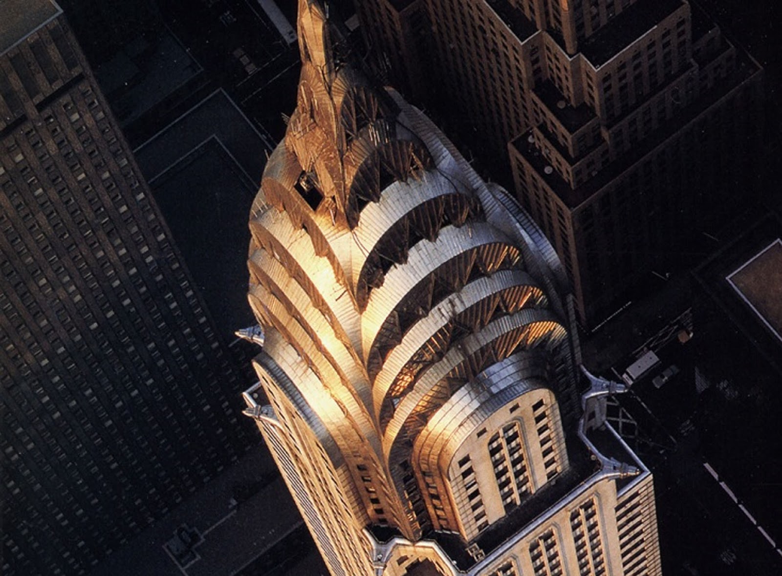
I managed to gather some very modern architecture found in Manchester, Bury and Leeds, in order to begin some ideas through drawing and mixed media. Geometrical structure, is what I found mostly everywhere but that is just the overall structure; zooming into those structures, gave me some very interesting designs to bring into my work.
fig no.1
Nevertheless, I realised a fact that having so many simple geometrical shapes could be very challenging for me. It could get boring and obvious. During the process of experimenting, I made this surface that almost looks like concrete rubbing, see fig no.1; but it was actually foil print using PVA glue and netting fabric as a stencil. My primary imagery had a lot of sky and clouds in it see fig no.2: as a human takes high angle shots. Primarily, this process of thinking through making helped me to have a strong Base to start a project with contrasting elements.

fig no 2
I tried to recreate the foil print on leather, repeatedly. To develop, I wanted a warmer background for the print rather than the dull white paper. After making multiple samples and getting the same result, I assumed it does not work. I took risk and put it through for engraving, and it actually looked very interesting. I believe, it looks very interesting with the concrete, see fig no.3
fig no.3

Techniques

Artist, Debbie Smyth, use of pins inspired me a lot, as I was already trying to create this crisp and strong look in my samples. How I could create those big structures as small samples? I wanted it small but detailed. As I developed my work, I started hammering pins down clear linoleum sheets. The initial thought was that these sheets look like the glass buildings due to their green tint. However, they are actually malleable so I could cut shapes into them.

So how I developed this thought was, if I can cut through it, I can hammer pins down; if I could pass pins through it, why not try using it under the sewing machine needle? And it worked; but very time-consuming, once the needles goes in, it makes a hole and if the stitches aren’t to my desire then I had to waste it. 

Due to its rubber like texture, it sticks to the machine foot and the part where the feed dogs are, so it doesn’t move by itself very easily. It just has to be at an angle where it’s almost hovering but also slightly touching. Therefore, I tried using Stitch 'n Tear, thinking it would tear off easily. However, it can be seen, it didn’t come off, even after using a coarse brush.


fig no.4
The stiches going in and out of something that almost looks like glass, was very unusual see fig no.4 Due to this reason, I believe my work could also fit within the hand and lock embroidery prize brief.


fig no.5
To help the viewer and myself, envision my samples in a real world, I have visualised them on cars. Assuming a car could one day have this technology to press the button and get some juice served. Or the car’s roof opens up like gills on a fish for fresh air, or swing to fan the insiders or used as heaters. If the little triangular pieces could tug up from a siren, light up and spin around in emergencies. Examples can be seen in fig no.5, 6 


fig no.6

Some more images of my final outcomes


Monday 11 February 2019

Development


Visualising

  • Select samples that are interesting and have a feel of futurism.
  • Visualise them through quick drawings and choose from them, what could be visualised digitally for a more understandable picture.

Scale of the samples

  • Time-consuming techniques could be done on a smaller scale.
  • Visualising them is a great way to decide what I want to choose to do more of. Meaning, I could pick a sample that I liked the best, and make a series of small samples, in given time; instead of, physically, increasing the scale.
  • If I wanted to make something bigger scale, it could just be visualised.


For instance, I have visualised this from my sketchbook on to a car roof, digitally. I could now make a longer version as a resolved sample.

Resolving techniques

Understandably, I could not make my final samples using all the techniques and experiments that I did to initiate this project.
Therefore, it has to be refined so they are more about what I discovered while experimenting then just using a technique that is already known. And I will be considering the following:

  • Use netting fabric to create concrete inspired texture.
  • Silver leaf, to achieve that futuristic metal like feel: such as underneath impasto prints, because to achieve that metallic background in a print is almost not possible with any other technique.
  • Consider using metallic leather, from sketchbook, for a contrasting warmer tone with the cooled tones.
  • Pinning and wrapping threads around them.
  • Clear Linoleum sheets – to stitch and pin through.
  • Laser cutting –I find this technique works a lot for me, not only because I like it but also because I feel the need to translate my drawings on to physical samples to bring that extra detail, and it works amazingly.

Thursday 7 February 2019

Time Management and CP2 35%


The pre laser cutting process is very time consuming. It gets even more time consuming when I have to sit for hours and delete those multiple lines, individually on Corel draw. It has always been the case. In my first project, I had to deal with even four lines.

In Intentions, the first unit, I could switch an engrave design with raster engraving as it is quicker and the laser didn’t have follow a specific line. Four lines, meaning the laser will draw over the same line four times, hence multiplying the time and cost.

  • Whereas this time I used leather and I wanted crisp lines of engraving.
  • Raster engraving could work on heavy materials like wood but not on soft materials like leather, therefore, I had to spend that time deleting all the lines.
  • When cutting, there is no other way; you just have to delete all the multiple lines.
 

Solution – Technician help: how to overcome double lines?

  • Investigate how to overcome or ‘over killing’ double lines on illustrator
  • What to do differently is, after doing all the tracing steps, window>pathfinder>select the image>object>group>pathfinder>outline.

35% assignment


First draft feedback – improve the quality of images, perhaps access the photography lab.  
  •  Induction – I was scheduled to be inducted in the last week due to, the photography technician’s and mine, timetables overlapping before; hence, all the sessions had been booked for the next two weeks.
  • I had to hold this assignment until the last week, due to this reason. Therefore, I had to fix those images on Photoshop as best as possible. An example is shown in fig no.1
  • Book the photography lab session 7 days in advance, unless someone cancels.


fig no.1

Tuesday 15 January 2019

Process

To help influence my ideas during the initial stage of this project i.e. drawing, I have wanted to look beyond the buildings and architecture. They are just a few shapes.
  • Experimenting with the netting fabric
  • Thinking through making
  • Learning and picking elements from mistakes.

fig no.1
·       Used it as a stencil, trying to create something like this foiled fabric fig no.1.Due to its funky look, I thought I could create something more subtle to achieve a futuristic feel. 
fig no.2 shows the negative of what I achieved in the first trial.
 ·      It resembles to concrete roads, so much so that it inspired me to take the ground and the sky as a contrasting yet abstract element to be introduced in my work.


fig no.2
fig no 3


There is a lot of sky involved in my primary images due to the human vs building’s’ angle., see fig no.3. Therefore, I have translated the grey clouds with abstracting silver leaf on different backgrounds to experiment.


Foil vs silver leaf

 Foiling – not as solid as silver leaf. I prefer silver leaf over foiling. After experimenting the foil on bond-e-web, PVA glue, impasto paste and double sided tape, double sided tape gave the most satisfactory result (as seen in the sketchbook).

Silver leaf – gives a denser surface and texture, extremely delicate to create a soiled ground; easier to control for abstract sections.

Pining

Fig no. 4 shows a sticker that is found on most security related food, I found this one on a Manuka honey Jar. Its subtle metallic lines attracted me to save it. I used it to try and translate it somehow through using pins. What I have managed to create, fig no. 5, looks more like a circuit or a very technical button of a machinery. 

fig no.4
Very hard to take the sticker off the jar, neatly.

fig no.5


Thursday 13 December 2018

Visual Research


Research – Self initiated


Primary Research


·        Looked at buildings, modern architecture to achieve a feel of futurism, as shown in fig no.1. John Lewis building in Leeds as seen on the right was very eye-catching to me when we had a trip to Royal Armouries in the first unit; The Rock, shopping centre in Bury, as seen on the right, also has very interesting architecture.
     ·         Zooming into the detailed rich sections, to inspire my work, and something I could translate in my own style through drawings and mixed media. 

fig no.1


Secondary research – artists, Companies, library research


fig no.2
In my feedback I was advised to always look back in the past to predict what the future might hold.

     ·         I was very inspired by the book Art Deco by Judith Miller. Futurism and Futurisms by Hulten, Pontus; Palazzo Grassi (Venice), some examples can be seen in fig no.2. It is seen how artists in the past had already designed the future buildings to be, so geometrical and colossal in structure, as we are witnessing today.


·         The Chrysler building in New York City, as seen in fig no.3 To me, it was very interesting to see that yet having the geometrical structure; it has a feel of the past. The colour and the details on the top look very traditional, a very balanced merge of the past and the present. 
 
fig no.3
·         Hospital Art – where people could look at an art piece and its modern nature could take it’s viewer to another world i.e. the future. To make them ponder and take them to a different world to where they are. 
·         Companies – Jason Bruges Studio’s installation in Great Ormond Hospital, called The Nature Trail, runs along a 50m length of corridor and aims to create a calming and engaging route to surgery.

The installation features illuminated and interactive animal characters, including hedgehogs, horses and rabbits, which appear in a forest and foliage wallpaper. The animals come to life when sensors in the ceiling sense movement below. See fig no. 4

fig no.4
fig no.5


·     Artists – Debbie Smyth, is an artist who draws with pins and thread. As seen in the fig no.5. I was very intrigued to translate this in a way that it looks intricate yet futuristic. Inspired from the idea of using pins, I have translated the photographs in my own style and then experimented the pins into different mediums, such as, metallic acrylic paint, hammered them down into linoleum sheets.

The dimension created by this technique is very interesting. The linoleum sheets look like the glass exterior found on buildings, due to its greenish tint; but it is malleable and the process of things going in and out from it is very unusual.


Engineering embroidery (Live Brief)


From my initial observations, I am aiming to produce an interior piece that could fit within a hospital or a public space such as transport stations.
The theme future forward will be influencing my work during this project.

Next step


·         Research beyond just the buildings, to bring some contrasting element.
·         More experiments and risk taking with the pinning technique with linoleum sheets.

Thursday 6 December 2018

Initial ideas

To begin this project, I had a few ideas for colour and the kind of feel I want to achieve.


Colour

  • Fresh oceanic or sky like colours such as blues.
During the thought process, when every blue colour started catching my eye, I found this, fig no.1, and instantly captured. The smoky, fluorescent shades of blue coming off this dark and geometrical structure, which was just the stove, was very interesting to me.
Fig no.1
 
  • The bright flame made me consider having metallics, again in my work. As I always end up having metallic colours in my work, and it has now become a part of the style of my work.  
Theme
For a project, to have one direction, a theme is something that gives me a visualisation of the designs, the structure, the composition and the overall feel of what my work should have. It makes it look more personal and most importantly, having common elements in samples, makes it look like it is one individual's work rather than a group work.

A few points to consider:
  •  To try something different then what I have been doing previously, such as the traditional embroidery and the architectural patterns.
  • Keep the intricacy, as it is a personal style; but perhaps do it differently this time.
  • Not changing everything what I have experimented previously.
  • Take elements from the experiments that worked in the previous project but didn't have enough time to develop them further. Such as, playing with silver leaf.

fig no.2

One aspect that I had begun to notice around me was the structure, how it has and it is changing. An obvious example as shown in fig no.2, I realised how minimalism has taken over the structures around us, architecturally. 

Evolving structures

  • Geometrical
  • Technology – I assume, humans' requirements are changing and increasing
    with its rapidly growing population. In short, more needs to be done in less time, for which, we rely on machines.

Future

·         Colour –we mostly associate future colours to be very dull; we see greys, blues, and primarily, no colours.

·         Lack of designs – we see how our mobile phones have evolved. Every year, their designs are developing to be just a plain simple box.

Things that were more intricate in their designs, consisted of round structures and flowy patterns, are now structural and deficient in rich designs. Just squares, triangles and rectangles are what we see in the new architecture, now-a-days.
  • I could base my initial research on searching for geometrical patterns. 
  • Try to investigate and look for intricacy in those geometrical patterns to bring the details in my work.


Evaluation

Initial ideas & theme Aiming to do something challenging and different from previously, I decided to have a contrary element then m...